2 Marketers 1 Brand Presents: Hubbub Labs
We took an education marketing agency apart live on a webinar. Their visual identity was the strongest in their competitive set. Their messaging was almost identical to everyone else's. Here's what we found — and what any B2B founder can take from it.
We did something a little reckless recently.
We asked LinkedIn to nominate a brand and then we pulled it apart, live, on a webinar. Two marketers, one brand, no safety net. George from Hubbub Labs was brave enough (or hadn’t read the fine print) to put his company forward. So we got to work.
This wasn’t a teardown. It was a diagnostic. The kind of honest, commercially-minded look at a brand that most agencies charge five figures for and deliver in a PDF you’ll never open again. We did it in an hour, on screen, with George walking in half an hour late to find us talking about his business without him.
So, what did we find?
The good news first
Hubbub Labs is an education marketing agency. They help schools, universities, and ed-tech companies cut through the complexity of marketing to their specific audiences. They recently rebranded, new logo, new colourways, sharper positioning, and to be honest with you they’re doing a lot of things right. Better than most, in fact.
We ran them through a competitive analysis against four direct competitors: SMRs, Waterfall, Bravery Media, and Tribal Impact. We lined up the logos. We lined up the colourways. We lined up the visual identities, side by side.
One brand jumped off the page.
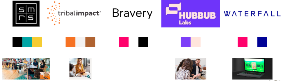
Hubbub.
Their violet is unlike anything in the competitive set. Everyone else is doing dark blue or black, because apparently that’s a rule somewhere. Their secondary colour is this sort of Financial Times pink that nobody else has. The logo stamp is bold. It’s ownable. It’s memorable. If you’re keeping score at home, that’s a strong foundation.
But a strong foundation is just the start. And this is where most B2B brands trip over their own laces.
The “we, we, we” problem
Here’s something we know to be categorically true across marketing and advertising: you is the most powerful word you can use.
Second most powerful? Free. But that’s a conversation for another day.
When you address the reader directly, you bring them into the conversation. You make them feel like you’re talking to them, not at them. We call it the audience-of-one effect. If you’ve ever listened to James O’Brien on LBC, you’ll know what this feels like. The man has a million listeners a week but it always sounds like he’s only talking to one person. It’s intimate. It’s what gave radio its power when it first started and it’s still what keeps people listening today.
Most brands have absolutely no idea this exists.
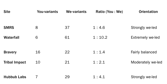
The ideal ratio is roughly three mentions of “you” for every one mention of “we.” The reality across the education marketing sector? Almost everyone is doing the exact opposite. One of the competitors we looked at was hitting a ratio of 1 to 4.6 in the wrong direction. They talked about themselves nearly five times for every single mention of the reader. Another was even worse.
Some people call it weeing all over yourself. We don’t call it that, because we didn’t think of it and we wish we had.
Hubbub was guilty of this too. “We are strategists, marketers, creatives.” Great. But the buyer’s question isn’t who are you? It’s why should I care?
Here’s the thing though: this is a remarkably easy fix and it costs you absolutely nothing. Go through your website. Every time you’ve written “we do X,” ask yourself: can I rewrite this as “you get Y”? You will be shocked at how much warmer it feels.
Your tagline is the most valuable real estate you own
We looked at the taglines of all five competitors. We’d challenge anyone to figure out what most of them actually do.
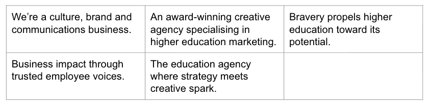
One reads: “a culture brand and communications business.” That could quite literally be any of the 24,000 digital marketing companies registered in the UK. Another goes with: “business impact through trusted employee voices.” We don’t know what the fuck that’s supposed to mean either.
Hubbub’s tagline “The education agency, where strategy meets creative spark” was the strongest of the group, and the reason is stupidly simple: it’s the most obvious one. It tells you who they’re for. It tells you what they do. That clarity is rare, because most brands mistake obscurity for sophistication.
But it could still be sharper. “Creative spark” is the weak link. Every agency on earth claims to be creative. That’s not a differentiator, it’s table stakes. What does Hubbub’s creative work actually do for clients that nobody else delivers? That’s the question worth answering, and it’s worth answering by talking to clients - especially the ones who don’t like you, because those people will tell you things to your face that the nice ones never will. Get a third party to do it. Nobody likes calling someone a dick in a business context.
There’s a bigger insight buried in here, though. A lot of the companies we looked at clearly survive off referrals. You can tell, because their taglines don’t need to do any selling. Nobody’s finding them cold and thinking “yes, that’s what I need.”
That works fine until it doesn’t. If your growth depends entirely on people who already know you, you’re building on borrowed time.
Same words, different logo
We pulled the ten most-used words across all five competitors’ websites. Hubbub was using nine of them. Nine out of ten.
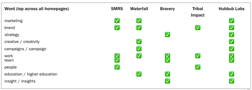
The visual branding is distinctive. The verbal branding? Invisible.
This isn’t a problem you solve by cracking open a thesaurus and swapping out a few words. It’s a problem you solve by rewriting your entire proposition from scratch, starting with the problem you solve for the buyer and working backwards from there.
Storm put it best on the call: if your mum can’t read your homepage and understand why someone would hire you, go back to the drawing board.
The stock photography trap
Hubbub, like two of their competitors, uses stock-style photography on their homepage. Smiley people in professional settings. The photos are probably real, team shots, client events, that sort of thing, but they look like stock. And looking like stock means looking like everyone else.
Nobody in this competitive set is using illustration. Nobody is doing anything visually distinctive with their imagery. And given that Hubbub already owns this bold visual identity with the violet and the pink and the logo, leaning into illustrative or playful imagery could put serious distance between them and the pack.
Team photos are great on an About page. They’re wasted on a homepage that has five seconds to make someone remember you.
Give your brand time to bake
This might be the most important thing in this entire piece and it’s the one that B2B brands consistently, infuriatingly, get wrong.
Campaigns don’t wear out. They wear in.
They become more effective over time, not less. The only people who get bored of your brand are the people staring at it internally, every day. Your team. Your board. The person who approves the LinkedIn posts and thinks “surely we need something new by now.” You don’t.
Think about Coca-Cola’s Christmas ad. When they released an AI-generated version, the creative community lost its collective mind. But if you look at how it actually performed in testing, it scored just as well as the original. Because Coca-Cola has been running the same concept for over 30 years. The emotional associations are already built. The truck, the bells, the feeling. Thirty years of consistency, compounding.
The research says it takes roughly two years for brand assets to start truly showing their effectiveness in market. Two years. So whatever changes you make to your brand - your colours, your tagline, your visual style - you need to commit and then not touch it again for at least that long. Ideally, much longer. Holding the line is one of the hardest things in marketing.
It’s also one of the most valuable. And it doesn’t cost you a penny.
91% of brands don’t have a mascot
Let that sit for a second.
91% of brands in UK branding and advertising don’t use a mascot. That’s a staggering amount of white space for anyone willing to be a little bit playful.
Brands that use mascots tend to outperform brands that don’t. They’re more distinctive, more memorable, more easily recalled. Compare the Meerkat. The Duracell Bunny. Tony the Tiger. These characters lodge themselves in your brain and refuse to leave.
And the brilliant thing? Most of them started as something completely meaningless. The Compare the Market meerkat only exists because “meerkat” sounds like “market.” That’s it. That’s the entire creative genesis. A guy in an agency thought the words sounded similar, and now there’s a meerkat empire.
John’s mascot, Hat, came from buying a ridiculous hat during lockdown. Storm’s Ramen Rascal was inspired by a dog. Rob from Salmon Theory was walking around Shoreditch, grabbed a coffee, and the name just fell out of his brain. He rationalised why it was good afterwards. That’s how a lot of the best distinctive assets happen. Not through strategy, but through committing to something slightly stupid and then never letting go of it.
Your mascot doesn’t need a profound backstory. It needs to be distinct, repeatable, and ownable. It can be turned into stickers, enamel pins, plushies, shower gel if you’re John. Every one of those is a brand impression that costs almost nothing to distribute.
An education brand like Hubbub could riff on the long tradition of educational mascots from Clippy to the sort of characters you’d find in a school textbook. The opportunity is enormous precisely because so few B2B brands are willing to be this human.
For the love of God, stop saying “solutions”
One more thing, because we can’t help ourselves.
If you are not literally selling water, stop calling what you do “solutions.”
We saw a stand at a trade event from a company that sells mats. Floor mats. They called themselves a “flooring solutions” business. This is what happens when you let a committee write your copy. This is how you end up with “business impact through trusted employee voices.” This is how brands die quiet deaths surrounded by words that mean nothing.
Say what you do. Be recognisable, not clever. The tagline that divides the room is infinitely better than the tagline that bores it, because at least the first one got into the room. If someone thinks you’re a poor marketer because your podcast is called Bin Juice, you probably don’t want to work with them anyway. They’re going to be hard work.
The observations above are free. The recommendations below are why you're here. They're also free — but we'd like your email address first.
So, where does this leave us?
Hubbub Labs is in a strong position. Their visual identity is ahead of the competition. Their tagline is the clearest in the set. Their product-market fit with education organisations scored 90% in our research.
But the gap between “good” and “unforgettable” is where the real money lives.
That gap gets closed by talking to your audience instead of about yourself. By sharpening your tagline until it’s impossible to confuse with anyone else’s. By making visual choices that nobody in your category is making. By having the nerve to commit to your brand for longer than feels comfortable.
Most companies only need to dominate about 5% of their market to build something substantial. You don’t need to be Deloitte. You need to be the only brand that comes to mind when your buyer has the problem you solve.
That’s what positioning does. Not clever slogans. Not pretty logos. A smack-in-the-face reason to choose you over everyone else.
Everything else is just flooring solutions.
Two Marketers, One Brand is a live series where John Lyons and Storm Mackay pull apart a real brand and show what trained positioning experts would do differently. Want your brand on the table next time? Get in touch.